Search the Community
Showing results for tags 'ui'.
-
I'm trying to make a custom window open at the press of a button by dissecting existing files, but a lot of them have stacks of other files that are required due to extra tabs 'n shit. Anyone know of a custom window that has only 1 window and no tabs? So I can see what it looks like. I tried looking at the mod Admin Tools, which is currently what I'm using to acccomplish what I want done, but there are so many extra files in there due to all the tabs. I can't single it down to the bare minimum.
-
Hey guys! In my quest to make my mod the most awesome possible I ran into some roadblocks. The one I am hoping you might fix is how much of tooltips are rendered outside of the API. For example there is not an easy way for me to insert small ammo round pictures to ,show how much of what ammo is in what place in the gun/magazine. This of how they did it in 7,62 high calibre. That was my goal but I can't really do that with the tooltip injection system in place right now (that I know of) IF I am missing something and there is a way I missed let me know! There is a way to render the progress bars like used for weapon repair status, but nothing for creating a line of small icons that I can see.
-
What every server browser has today in games 1.Filter to make full or empty server invincible 2.Filter that makes server with an specific ping invincible 3.Filter that make password protected servers invincible 4.Filter that shows how many days has past ingame (wish for Zomboid) 5.Filter anything from the server specific modes/options 6.Filter to show how many time an Server was Online/Offline to filter out unstable ones
-
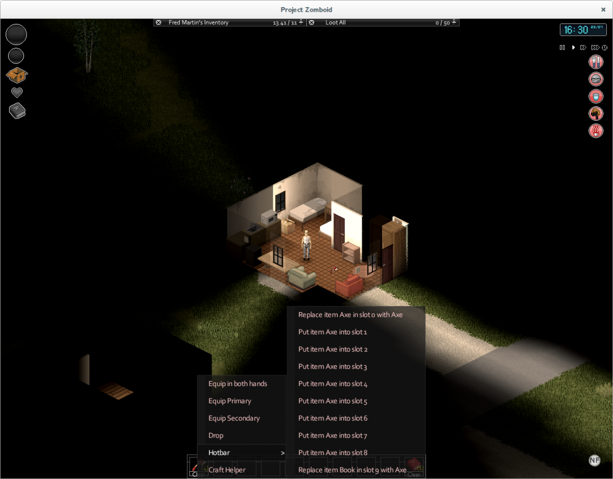
I blame lemmy for this, he put the idea in my head This is a mod adding a hotbar for quick item access to the bottom of the HUD. You can get it in three sizes: - Small: - Medium: - And large: You can find the settings and a configurable button to toggle the hotbar in the options menu: And attach items to the slots via the contextmenu: And quick access the context menu from the hotbar with RMB: And finally, download the mod here: From the workshop: http://steamcommunity.com/sharedfiles/filedetails/?id=503645367 From github: https://github.com/blind-coder/pz-hotbar/releases/ Requires bcUtils: https://github.com/blind-coder/pz-bcUtils/releases Changelog: Enjoy!

- 53 replies
-
- 19
-

-
 It rustles my jimmies that while the nutrition (hunger) for food and remaining condition of weapons is neatly displayed when you expand the item in inventory, it doesn't show the remaining amount of drainable items and water containers, making you having to hover on each item to figure out which item is partialy depleted and which is not. It's less problem for water as you can pour water from one container to another, it's really problematic with other items, if you want to take a item with more uses on you or use up the ones that are partially empty to gain some extra weight in containers, since you can't combine them (another feature I'd love to see BTW). I know the UI update is coming down the road (I think!), but would be nice to see that before it anyway
 -
I added a custom ItemContainer to an IsoObject. In the inventory UI, it's now displayed with the default cupboard icon. How do I change that icon?
-
Gotta love all those sturdy sticks laying in my yard...
-
Dying in Project Zomboid is rather a common thing, so you have to see this screen often. It's something that haven't been really touched a long time, so here we go. A new character creation screen will start of your own character picture to the left and settings that only affect your look. So, screen 1: look of your character. Here you can customize your gender, hair, pants / shirts, etc. Also note the screen shouldn't be semi-transparent and a different sound loop should be played. The background for this screen is backpack with clothes coming out of it. When you're happy with current look and press NEXT button, a flash should appear and a sound of a camera should play, that's like your photo will be taken. A flash would be the transition for the screen 2. Once flash go away, you will see another screen, this one will look like a passport of a Knox County citizen. An animation will play as your photo miniature is placed (glued) on the passport. The passport will look like an, uhm, passport I guess? Here you can enter your desired name, surname and a spawn location which will say birth place or something like that instead so you enter this in the empty passport's fields. That is a screen 2, the character profile. As it's the second screen, there will be BACK button, and once you press it a "rewind" animation will play, GUI will become glitchy as the old TV and it will reverse back to screen 1. As you're satisfied and you press NEXT button here, a Knox County stamp animation will play, passport will slide away and reveal another screen: screen 3. Here you choose your occupation and traits, however I haven't really thought of this yet. I'll update my post then. So what do you guys think?
-
I'll just drop this here and ask everyone around to please please please stop me by telling me this work is totally redundant (I'm having fun doing it anyway, so...) inventoryscreen_001.zip
-
I was wondering if there was a way to enlarge the Day/Month text in future updates? I can see it clearly but it can be hard to tell what date it is sometimes in a pinch. Also i know this is just me but please make an option to be able to switch the default layout for the Day/Month bar where it can be Month/Day?
- 3 replies
-
- 1
-
-
- Singleplayer
- Multiplayer
- (and 1 more)
-
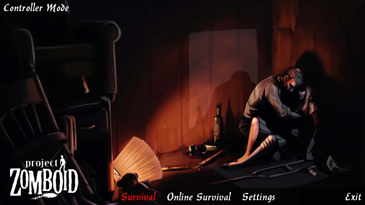
[idea/Suggestion] While I was playing Build 30 or 31, (Don't kill me if Build 31 isn't out yet, haven't paid attention and its 10:52 PM here ), I noticed that the UI isn't top notch nor very stable. I understand that we are on either build 30 or 31, but the UI needs to get a refresh like... right now. I've read the future of the game and how they'll update the UI drastically for the following next builds, however; I decided to create a UI that simplies both keyboard and controllers in hand and hopefully helps the Developers in mind. Keep in mind that this is not fully art designed and its only to improve functionality. --The Start Of The UI-- The first section of game will start and prompt the user on how to start the main menu or to begin interacting with the game once its done loading, simple stuff here. If the person hits ENTER, the game will run on Mouse Mode. Should be very self explanatory, if you hover over the text, it turns red that tells the player he or she has selected the option. If the person hits "A", the game will run on Controller Mode. This one is a little hard to explain, when the player uses the moving buttons, (Left Stick, Right Stick, D-Pad, etc..) then the red will highlight red after moving. For example, the game will always highlight survival when using controller on boot. If I use the D-PAD to move towards the left, it will highlight the other option I have and highlight it red. It will of course dehighlight the previous option that was selected. It shouldn't be rocket science, but its a nice start. --Game Selection-- Once the player hits "A" or enter, the screen will change towards this following "diagram". The Menu will be greeted and the person can just move their mouse/left stick towards any of the three choices. Survival Classic/Sandbox/And Challenges or AKA Custom Maps. Mouse users should know that they are not affected, and controller uses are benefited from the change since its simple to left click and press A at the same time. Hitting ESCAPE or B makes it go back towards the main menu. --Online & Settings-- I'm still working in this section, either on wed or friday I'll show the other missing segments so both can enjoy the simplistic interface. --Character Creation and World Settings-- This one should be easy to create, same like the previous one, I'll eventually explain how these will work. That's all for now! Keep up to date towards the thread every week, hope to solve many issues. If you have any questions or concerns, please feel free to drop a reply! I'm aware that there are other UI's, but I think this one should be much simpler for newbies. Happy Zombie Hunting! -Videogameget 12/7/2014 11:12 PM PDT
-
Hey I'd like to make just a tiny suggestion for an alteration in the behaviour of the user interface currently. It won't take much doing but I feel it would improve the usability of the interface a bit. Here is my proposal: Disable mouse-over opening of inventory tabs when Ctrl is depressed. That way you can look around without having your inventory popping open, which I find incredibly irritating.
-
The drop menus on the UI should be able to have the list/screen/etc open both below or above the title bars. Example: For the loot list/menu, the "Loot All" bar could be below the list of loot, so that when the list is closed, the "Loot All" bar can rest at the bottom edge of the screen.
-
The Base.Map Item Looking through the list of items that can be spawned in the current IWBUMS build, I noticed a new item, Base.Map: Does this have any use yet? As far as I can tell you can equip it, but it does not actually do anything yet. I'm curious, what are the plans for this item? Current Maps for Project Zomboid I dislike using online resources such as pzmap or the Wiki because to me that feels like cheating. My character shouldn't magically know where everything is in the world. Unfortunately given how big the map is now, and will continue to expand with future additions, it has become almost impossible to navigate without some sort of map. I think adding an in-game map that a player can 'uncover' by exploring, similar to what Minecraft does, would not only remove the need for an external map 'cheat', but would also provide the player with a useful mechanic for figuring out where they haven't been, and a neat metagame to try and uncover all of the map. Proposal for an In-game Map Ideally, if I equip the Map item, a new UI window should open that shows all the parts of the map that I have explored so far, in a simplified, scaled-down rendering with basic pan/zoom functionality. It doesn't have to be pixel-perfect like pzmap, but clear enough that I can recognize the layout of buildings and such. For an example of what I mean, here's a quick mockup of what the map could look like as the player uncovers it: (click for full size) And what it could look like fully revealed: (click for full size) The map should be generated dynamically based on what is currently in the player's view range, so that: Changes to the world, such as a house burning down, or new farms/constructions would only appear when the player can actually see them It would work regardless of what map a server decides to run, even if it's a custom map. The map offers the player a way to figure out where to go: "oh I never went down this street" Other potential mapping mechanics: You can share a map with another player (if they have paper and writing material). To account for the transfer time of the map image data that the client would need to receive from the server, this process could use the same progress-bar UI as when reading a book. After all, copying a map takes a good bit of time anyways. You can only add to the map if there is enough light, so you would need to either map the area during daylight, while streetlights are still on, or with a light-source. The map window would just read "It's too dark to see where you are" A simple marker placement mechanic that allows you to mark points of interests. Right clicking on the map brings up the option to place a marker. A marker stores a short title, and an optional short description. (Aquaria had a similar mechanic) Instead of requiring a Map item, just bind the mapping mechanic to 'M' and just let the player always use it. Similar to Aquaria it could just cover the whole screen while you are looking at it, and M just quickly toggles it on and off. Finding the Map item now just adds a faded out underlay below the map that you've uncovered, so you know where everything is, but can still see where you haven't been. Some server-side settings could include: Enable Mapping Enable Map trading Enable Mapping requiring light Enable Player's position on map Enable Nearby Player positions visible on map (perhaps in conjunction with a radio or other item that enables a 'party'?) I would also like to strongly advise the PZ devs against just implementing an in-game version of pzmap. You have the potential for a really fun mechanic here, that will force players to explore, and also help them figure out where they have not explored yet. Just giving players a static image of the current map would be dull, and not nearly as useful.
-
 I've had a look inside the "LastStandSetup.lua" found in the SteamApps/lua folders. I noted that essentially, the Last Stand and subsequent Challenges, are in fact written as if by the way of a modder- that is to say, everything in there is handled from event handlers. Neat. I've took it upon myself (after being unable to find anything on the forum under User Interfaces), to have a shot at achieving the following: STEP 1: Create a button that slots in alongside the initial game UI. Like so: STEP 2: Once the button is clicked, execute the code to join the server's I.P Address. And thats it! basically! I haven't looked at any of the multiplayer code, but I've been diving into the UI stuff, would I be right in assuming it is not without the realm of possibility to use the following event: OnPostUIDraw To create some kind of button to achieve this? Watch this thread for more progress as it happens-
 -
I was just wondering if you guys were planning to make it so when food items became rotten their icons would change. This way I wouldn't need to mouse over my items to see if they are rotten, and can I just look at it! Iunno how hard it would be to do this, but to me it seems really simple (sorry if it's not) and makes the game more user-friendly in a reasonable and realistic way. PS: Sorry if this has been requested/suggested already. I used the search engine and couldn't find anything. Hopefully I'm not just blind I added tags to my post, so hopefully noone will repeat it in the future. .?
-
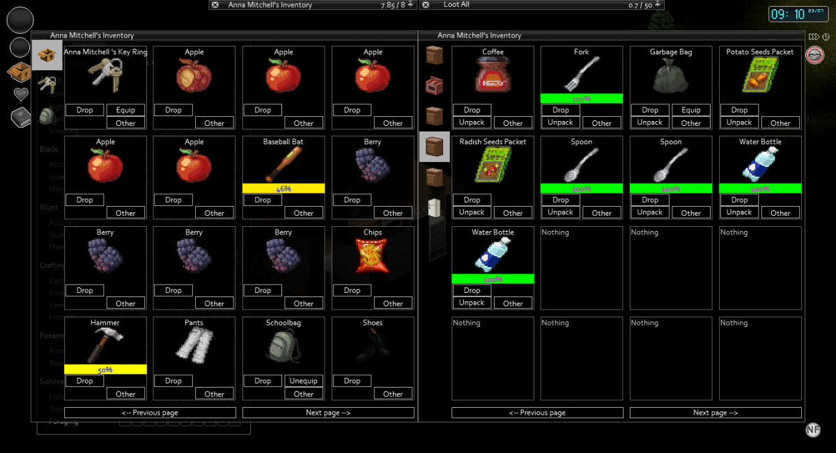
Dear PZ-Community, i am writing to you because in my humble opinion, the inventory ui could need a change. I like the way the game gets along in development, the features are already enough to name the game a "time sink" for me... and the best - it's very stable (for me)! The only thing which kinda annoys me is the way the Inventory is organized. I'm a collector and scavenger, organize them strictly in base but this is very time consuming in my opinion (i dont mean the times for unpack/drop etc., just the UI). The Inventory should be more "informative". tl;dr My Suggestions would be: add seperate Weight / Size tabs (sortable!)make name/category/weight/size tabs sizeable and/or hideablecount as prefix (avoids "trimming" with long itemnames) instead of suffix*optional/needs discuss* change "unpack" "drop" etc. buttons to icons (per opt-out maybe?) to clear space up for easier multiselect*optional/needs discuss* how about multiselect with checkboxes and a hotbar with buttons for unpack/drop? Thats for it, maybe you guys can come up with some additional ideas or shape the rough diamonds i dropped here kind regards, Okeer P.S: no native english speaker... sry for it //edit - thx, sry for repost
-
Hello there people of the forum. First post and straight to suggestions. Haven't noticed that anywhere else, but you never know. Now that we have 23 in beta and position of windows are stored with save (shame visibility isn't), there is only one thing that really bugs me. What I'm missing is lock (ex. an lock icon below heart). That way one could move things around and once happy, lock it, so that it won't be possible to move windows by choice. I was just stung far too many times with accidentally moving window when trying to move things from one container to another. Couple of times found myself with windows stuck to my cursor - luckily windows are limited by window size and I managed to click at the header bar and retain the control. It all might be related to fact that windows can be moved by dragging them at any place, instead of limiting it to header bar. Lock option should be simple to do (even before moving 23 to main branch?) and would allow freedom of choice, where by default it would be "open" essentially retaining current behaviour.
-
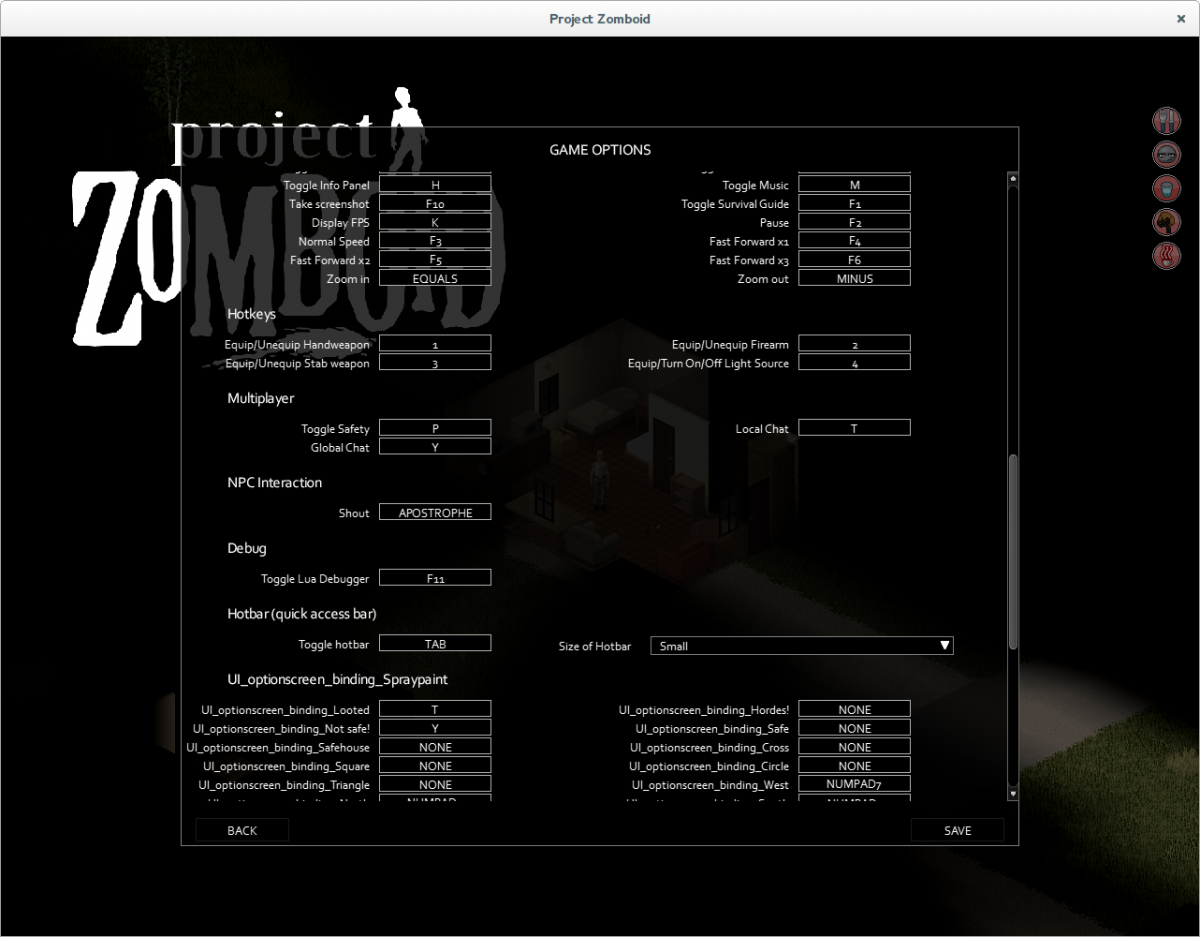
Not sure if this qualifies as a bug, but it should be. When you go to bind a key, if another key is already bound to what you want, you simply can't bind it. Then, you have to go rebind the other key to some random value, it's a PITA. Should be how it is in most other games, when you do this it forces the new bind and the other action is bound to a "null" value.
-
Currently, the UI layout is not saved across new games, forcing the player to reposition the menus to his favorite position each and every game. I suggest saving the layout information (visibility and position of menus) and loading this on every new game/load.
-
Why do I see bearded balded men zombies in skirts running around with lipsticks in their pockets? o.O (but onto more important topics...) I might be adding more suggestions but that would most likely depend on how active the devs (or a designated spokesman) will be at engaging the community. I also hope that no one will think that by this I am asking for a preferential treatment of some sort, I am just merely stating what will motivate me personally. Currently I will be surfing this forum for a week or two to make my decision, and who knows I might be adding more suggestions. There is lots of room for improving in this game and it is brimming with potential. In the future I hope that it will get the attention it deserves, but for now it has mine. UI suggestions: A smaller inventory tab view option for the more experienced players. A visual notifier of a unspent attribute point(s). or
- 3 replies
-
- 3
-
-
- UI
- User Interface
- (and 3 more)
-
Heyho, I've created another tutorial over at pz-mods.net which explains how to use inventory context menus. How to create Inventory Context Menus It especially shows you how to differentiate between single items, stacks and multiple stacks of items. Hope it helps! P.S.: http://thecodinglove.com/post/47120159615/when-my-code-works-on-the-first-try
-
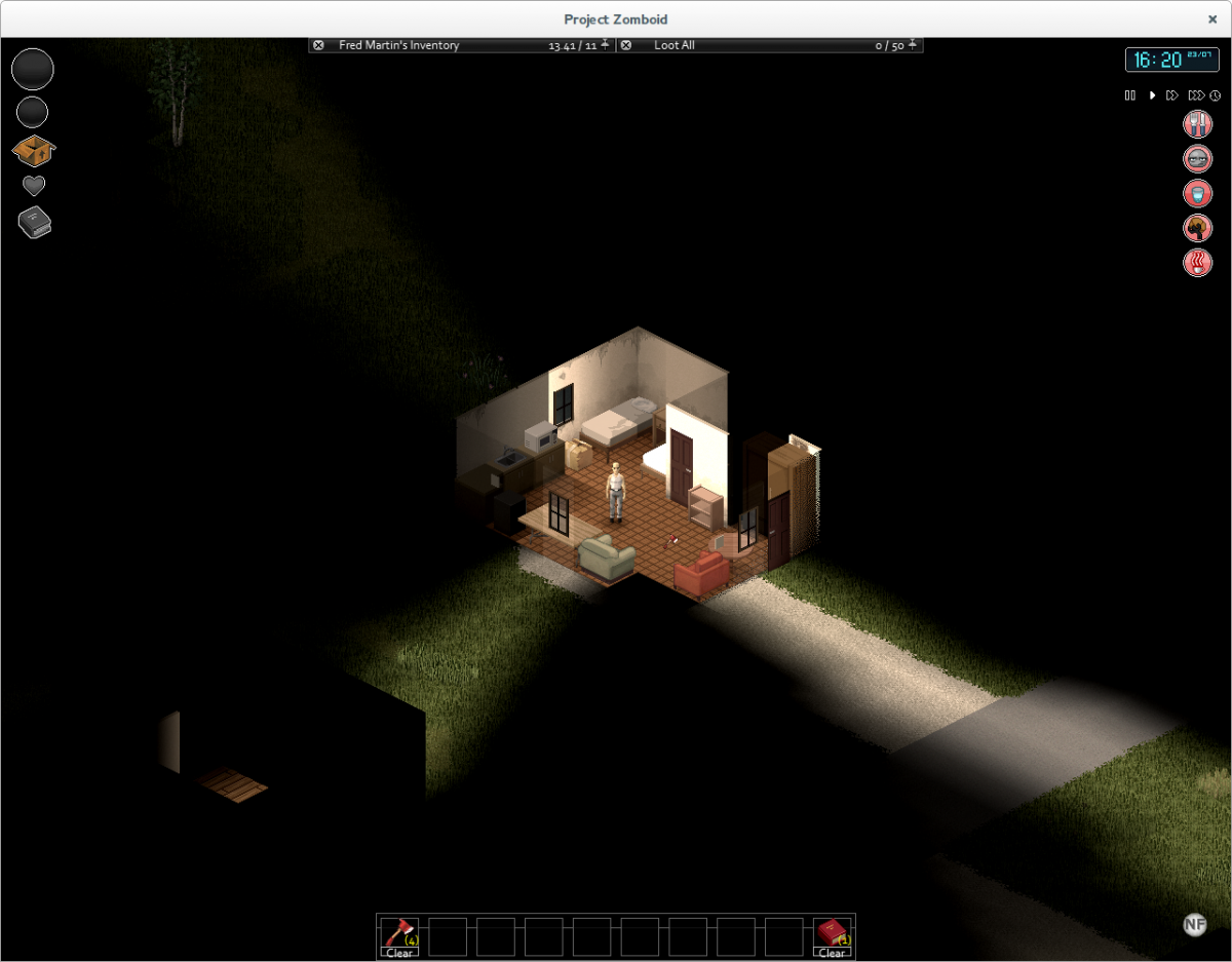
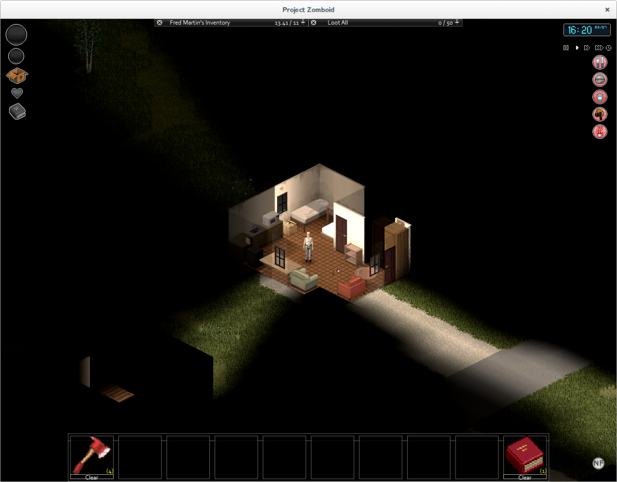
Now that all zombies / corpses have standard clothing items in their inventories, I find it much more tedious to sift through their pockets. They carry valuable items sometimes, but clicking through a stack of bodies and noticing the odd extra item is difficult. As we rarely need to loot more than 1 or 2 zombies / closets for clothing in an entire game session, I think it would be useful to have a clothing filter for these (and possibly other) containers that can be turned on and off, making it easier to spot items of interest. I don't think this would be unrealistic or against the spirit of the game. If I were looting in real life, I would be able to ignore clothing when searching a body or a wardrobe for useful items.