draxo
-
Posts
18 -
Joined
-
Last visited
Recent Profile Visitors
246 profile views


draxo's Achievements
-
I love the new moodles. They are clearly the work of a professional who had to consider a lot of things while making them. ☑ They are clearly made in vector to be able to export in different sizes for different screens. ☑ Face expressions are easily identifiable, even from a distance. ☑ All the space in the circle was used to the fullest, and the outline is part of an icon. So every pixel's aim is to inform the players. Yes, we haven't seen the others yet, but I'm sure that they will all be as consistent and thought-through as the ones we've seen. It takes a couple of minutes to write an angry commentary, but a lot more time and thought are needed to make something like that. And most importantly, the new moodles are a sign of commitment from Indie Stone to make this game so much more than it is now. Pixel by pixel, bit by bit. People should praise that, not criticize.
-
Maybe you should try the integer scaling guide. But in this case, you can use 1280x800 windowed for 2x scaling in fullscreen, resulting in 2560x1600. And if you have any questions, I'll be glad to help.
-
#4 TV and Radio UI Immersion I like to use an oven interface so much because it makes me feel like I'm actually cooking something. Turning a knob, hearing a little "click," and then hearing the bubbling sounds creates a pleasant feeling of real presence in this hostile but at the same time strangely cozy world. I tried to transfer this feeling to interactions with TV and Radio. Controller friendly. Both interfaces should be easy enough to navigate on a controller. BTW, if you haven't tried to play Zomboid on a controller, I recommend you try. This adds a lot.

-
 I'm not an expert or anything but I would try this: 1. If you're using windows 11 you could turn off "Optimizations for windowed games" in Settings > System > Display > Graphics > Change default graphics settings. 2. Check DPI Scaling settings Right-click .exe > Compatibility > Override high DPI > Choose "Application" 3. Logi Options+ is a good suspect as well so you can try to unistall it and see if anything changes. 4. If nothing helps, you can always try troubleshoot in clean boot mode.
 -
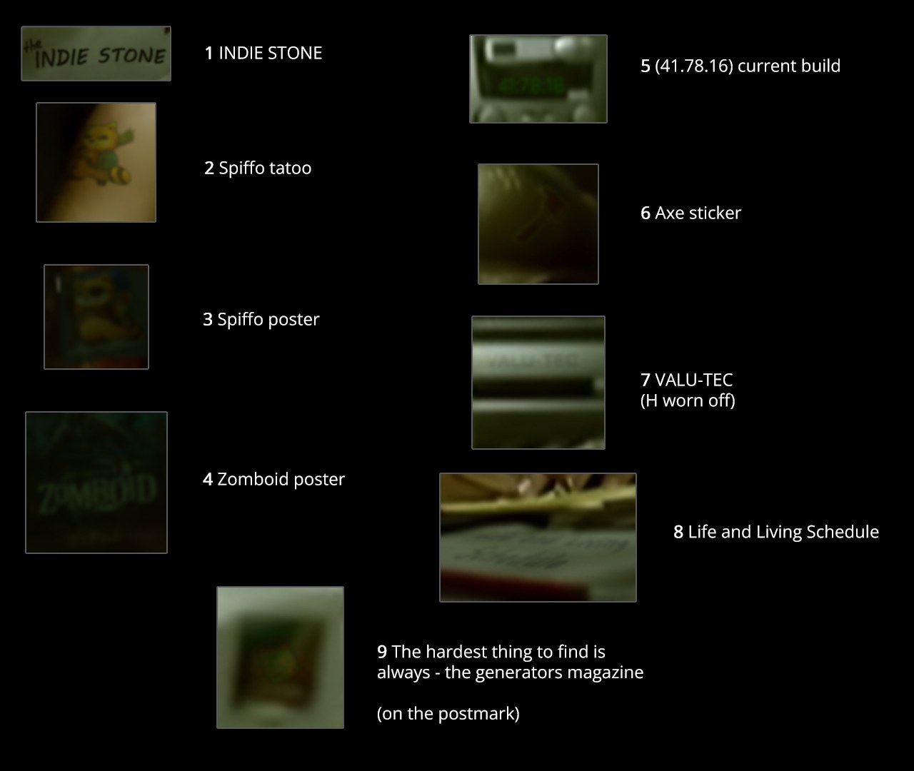
As I said previously I put 9 Zomboid refferences in the top picture for Zomboid fans. You're welcome to find them if you like solving puzzles. The answers will be under the spoiler below. ↓ Good luck.
-
Thank you for your reply. I really appreciate that. It is very inspiring to read that someone liked what you've done. I thought about your idea about customizable corners. We have 4 corners, so there may be top/down or left/right changes. As I see it, when it comes to text, our eyes find it more comfortable to look down rather than up because we read in this way, scroll in this way, and just got used to it. I guess the main reason why players put UI on top of the screen right now is that it always collapses to the top header, so it's not possible to pin it to the bottom of the screen. But again, I might be wrong, and maybe a lot of people just find the top UI more comfortable. So maybe for them, the top UI option would be justified. About the left and right panel swap I personally see nothing wrong with that (except extra programming work, of course), but the reason I put Inventory to the left for now is because looting is a big part of the game, and this way the loot panel becomes closer to the center of the screen.
-
#3 Car Logos So the aim here is to add a teeny tiny bit of immersion with authentic car logos. I wanted to make them 100% original and, at the same time, add a little dejavu feel to them. I tried to show every car's original character as best I could. Let me know what you guys think.
-
#2 Vehicle Mechanics UI Categories. So to stay splitscreen-safe, we have to make UI windows occupy less than a quarter of the screen, and man, it was hard to achieve this with the mechanics window. There is a lot of text to read when it comes to this window, so vehicle parts were grouped into categories. Every category shows the average condition of all parts in it, so you can quickly check a car with one glance. Specific parts. To not repeat the positions (front left, front right, rear left, and rear right) condition icons were placed next to the corresponding vehicle part on the car blueprint. Oh, and the first category you see when you open up this window is "Main" with Engine, Battery, and Gas Tank. Details. More detailed information placed on the right side. And if you think that there is too much empty space in there, I have a little something for you in the next post.
-
#1 Overall UI All this is based on three ideas. Immersion, respect for the original design, scaling, and splitscreen safe. There are no distractions in the default view, so you can really focus on your story. Any panel can be expanded by moving a mouse to the corner of the screen. Easy for the new players, familiar to the advanced ones. Inventory. Categories. Sort by category view changed to display every category name once on top. The reason for this is the extra space occupied by repeating the category name for every item. As a result, you should be able to find anything you want fast and easily. Number of items. Near icons on the same line. Again, for faster comprehension. Container icons. Placed at the bottom of the window to be on the same line with the rest of the interface to make it more coherent. Time controls. I didn't come up with any particular reason for the player to see time controls all the time (pun intended), so it auto-collapses. Maybe it should collapse to the pause icon instead of the clock icon. I don't know, you tell me. Weapons. Quick access is visible only when you move a mouse near the weapons panel. Stats. This includes all other menus in a compact and easily accessible window in the right corner. The health menu opens first by default. Players on a controller can open it with just one button. So it's much easier. Splitscreen players benefit because the window doesn't cover another player's screen. (The skills window killed a bunch of characters when we played with friends. That actually was pretty funny, but still...) Moodles. They are already in a perfect spot, so no changes here. So in a collapsed view, moodles and "the shaking heart" are the only distractions. I'd really like to hear everyone's opinions about this. And check the first message for source files and contacts.
-
What is this? This project is a way to say "thank you" to the game we love. For moments of genuine excitement, for tough choices that we learned so much from, and for letting us forge our own survival stories. I lived and died in Knox County, and I will always remember this part of my life. This is a work in progress. Some things can be rough around the edges. Some things may turn out to not be a good fit for Zomboid. Just bear that in mind. Everything is changeable. We would want everybody to join in. Contact me directly or by email at thisishowyoulived@gmail.com if you want to participate. Or if you want to help in any way, have any suggestions, or just want to say hi. If you want to use it. Feel free to use everything in any way you like. Download. You can find source .psd files, uncompressed .jpg and additional information on Google Drive.
-
Thank you for your reply. I understand you, but I'm not exactly trying to squeeze myself into the team. I'm just working on some stuff, and I was hoping for some competent feedback. I see my work as a love letter to the game and the people who made it. As far as I understand, you are saying that I should put everything I do here in a community. Well, then I will do just that. And let me just say that my wife and I deeply appreciate all the time and effort you guys put into the game. And we want to sincerely support you the best we can. We are sure that Zomboid will get the recognition it deserves.
-
Yay! This is so heartwarming. You've got some impressive rap skills. You guys are every bit as cool as I thought. Your openness to the community is what made me write to you in the first place. I can only imagine the amount of pressure you are under right now with the new build and everything. So I didn't want to bother you for no reason. My emails included work on: Title screen font, Interface font, Overall UI, Inventory UI, Mechanics UI, and UI Scaling. And since my last email, I have made Authentic Car Logos, TV Interface and Car Blueprints in vector. So, what should I do?
-
Thank you. I'm really glad that you liked it. Yeah, maybe it would become a Zomboid meme someday.
-
Oh man. I'm sorry if I gave you the wrong impression by using this reference. The idea of a hardcore Zomboid fan with a Spiffo tatoo seemed pretty funny to me. To make it more interesting, I even put 9 zomboid references in this picture for others to find. I just wanted to ask about my emails in a non-boring way. And as you recommended, I gave Stan another listen. So don't worry, my wife is okay. She helped me to make the picture.
-
Um. I'm not sure I get it. What does it mean?