Search the Community
Showing results for tags 'User Interface'.
Found 10 results
-
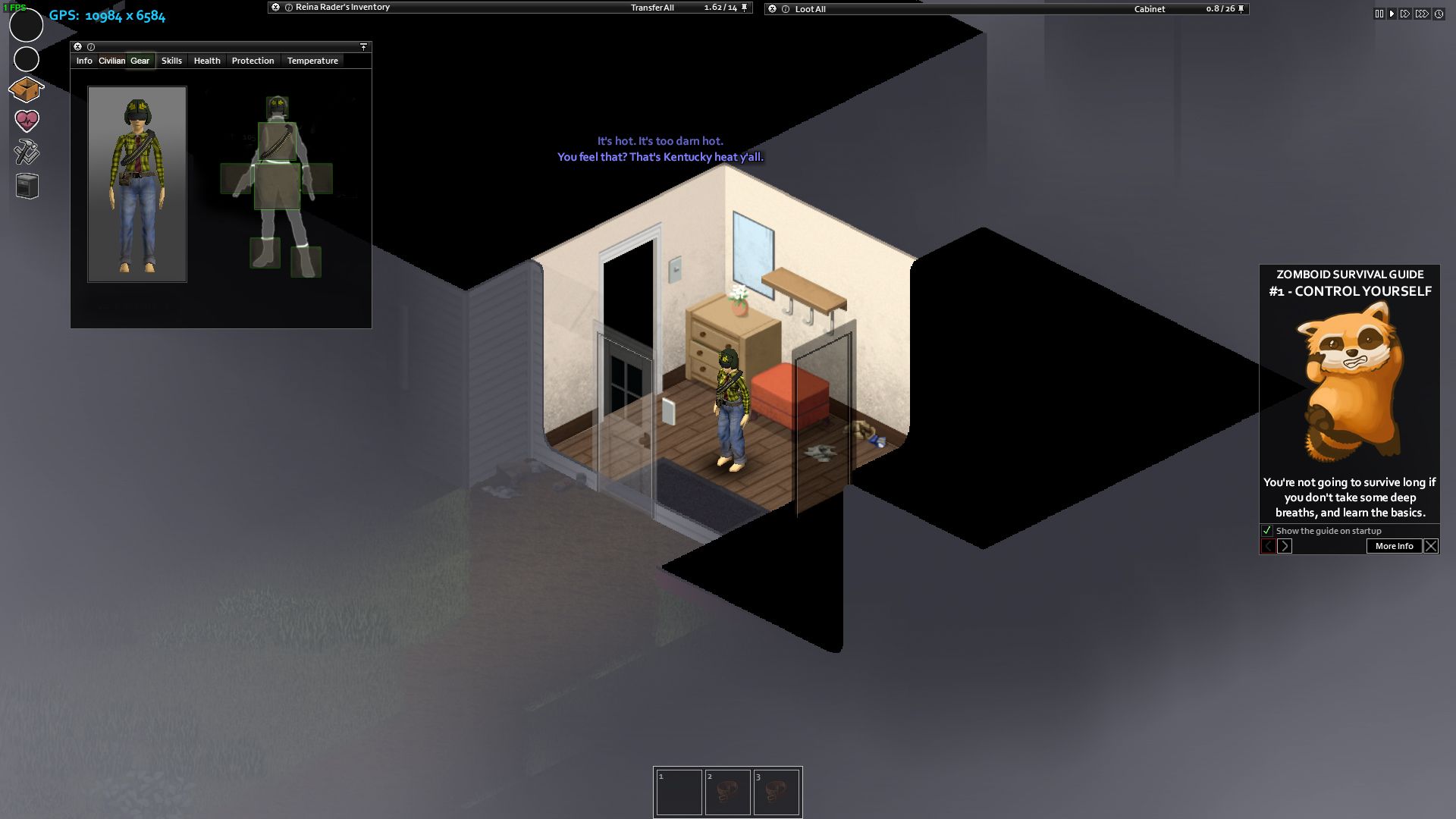
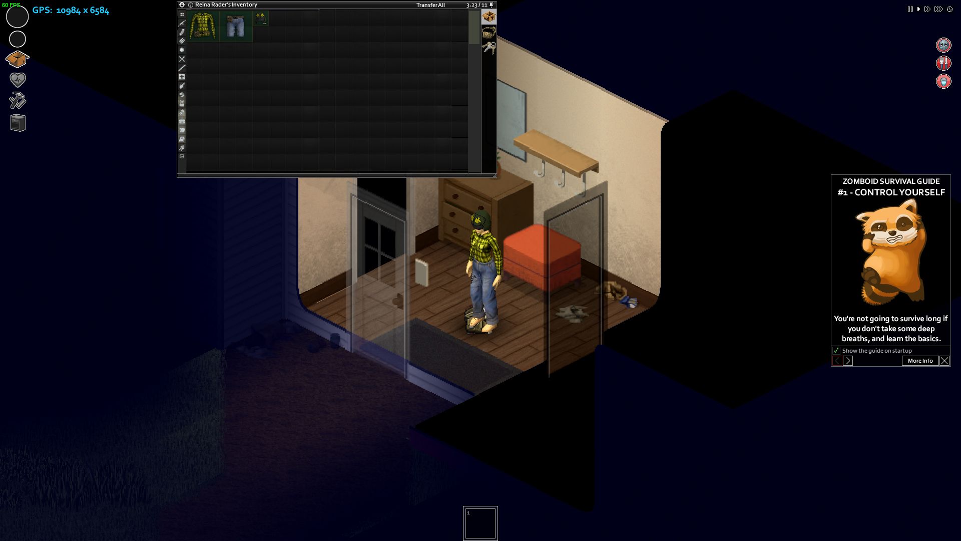
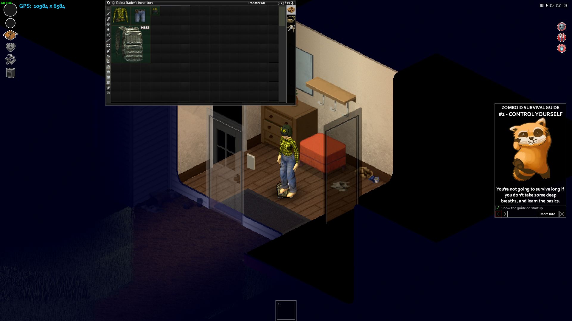
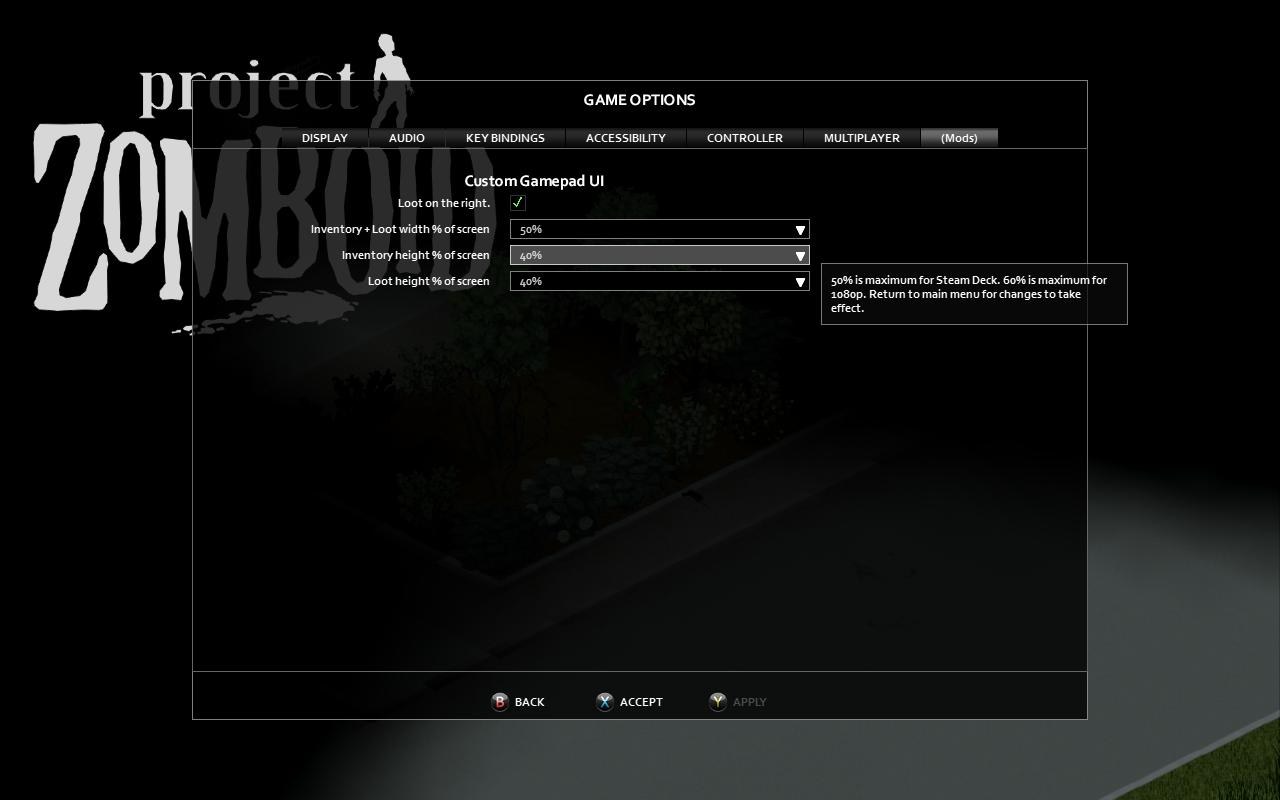
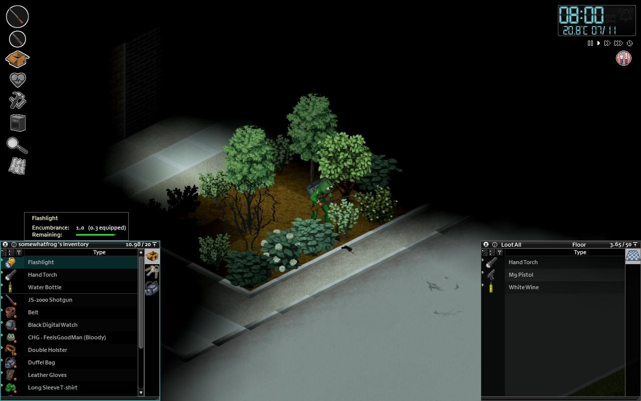
 Hello! I guess there is not that many controller or Steam Deck users which probably also means lack of feedback. I am a controller user myself (accessibility reasons) and since B42 is nearby I thought it's a good time to suggest a very simple to implement chage. From the very first day I got this game about one year ago one thing bothered me: invenotry and loot menus cover half of the screen. Even though it is possible to adjust those using mouse or touchpad it is far from comfortable (or precise/symmetrical/alligned for all the perfectionists out there), and then manually made changes don't persist. Half of the screen is enormous on 50" 4k TV by the way. That same month I made a mod which changes the math behind how it is drawn. It allows players to chose in percentage how much of the screen space said menus should take on their screen. This includes both vertical and horisontal space as well as positioning. Players can choose to have inventory on the left and loot on the right with plenty of open space in between to finally see their character or keep both menus together on the left. The change to the math behing calculating sizes works well for any common resolution including Steam Deck and split screen players. Chosen layout persists between restarts. Here is the vanilla part of code behind it in ISPlayerDataObject.lua: --some code else local ww = w local hh = h self.x1left = x; self.x1 = x; self.y1top = y; self.y1 = self.y1top + (hh/2); self.w1 = (ww / 2); self.h1 = (hh / 2); self.x2 = self.x1 + self.w1; self.y2 = self.y1; self.w2 = (ww / 2); self.h2 = (hh / 2); end --some code Here is the change I made to it: --some code else local x = getPlayerScreenLeft(playerID) local y = getPlayerScreenTop(playerID) local w = getPlayerScreenWidth(playerID) local h = getPlayerScreenHeight(playerID) local ms = CGUI.Options.ms --loot menu position (boolean) local mw = CGUI.Options.mw --inventory + loot width (%) local mh = CGUI.Options.mh --inventory height (%) local lmh = CGUI.Options.lmh --loot height (%) self.x1left = x; self.y1top = y; self.x1 = x; self.w1 = (w * mw / 2); self.h1 = (h * mh); self.y1 = h - self.h1; if ms then self.x2 = self.x1 + w - self.w1; else self.x2 = self.x1 + self.w1; end self.w2 = self.w1; self.h2 = (h * lmh); self.y2 = h - self.h2; end --some code Here are the screenshots at Steam Deck resolution plus settings used: Having mods is great, but when it comes to multiplayer one have to somehow reach to unknown person behind the server and make them add one more mod which is usually not possible. I would be so happy to see something like this implemented. Thank you, I love your game.
-
 This bug is about UX on Steam Deck. So, there are two ways to open a info panel in game. 1. Click the icon on the left side of screen. 2. use SELECT button and Right Stick to navigate on a hotkey wheel. Now the problem is that when i use first way to open a panel like health info, I couldn't close it through press the B button, which is counterintuitive.
 -
Despite the model for the TV clearly having channel and volume knobs on the face of it, you can't use the interface to change the volume prior to turning the TV on. This is counter to how it works on such models, where the volume could be adjusted regardless of whether the TV was turned on and displaying an image.
-
Hello , so i was thinking of suggesting an UI overhaul to make it way easier to navigate through inventory. (i love PZ) and i want it to be even better. (Current inventory seems so old and outdated since it was created almost 10 years ago , and imho it could use some upgrade) So here are some of my suggestions for this idea. Also sorry for my poor english. 1. Overhaul of Character Cloth slots and Armor/Weapon Slots. (this is just a image reference and could be done much better) Pluses of such new inventory could allow players to easy understand what slots for cloth and gear is open. Few things that can be added to this - When hovering over one of cloth cell , open more cells to choose what slot to use (for example if we want a tie so we can attach it to middle cell) - Adding name plates to cell items - Adding option to rag the items from this screen - We can also see our character in the left which is a bonus too. - Adding slots for belts (i forgot to add one) - Adding sub slots for other miscellaneous items 2. Grid Inventory , instead of a list one we have now. (Grid would make a great adition since its used now in almost every game as an inventory management style. (the picture is just a reference, and could be done much better - adding more natural colors , names to the item cell , adding durability indicator especialy for armor , and other) The pluses of such system Easy naviagtion. Sorting items (selecting item type in the left side of the scroll bar). Rotating items , organizing inventory will also play a role now , since players will have to organize their inventory in order to carry more. Also there could be introduced a new system for bags and backpacks (actually for any container type item that) - so if a container gets damaged then less weight it can carry and some cells would go red making them unable to use until the container is repaired. This new overhaul could also add a new put items in container that is in the backpack for example , if we want to put medicaments in our first aid kit , we could just open the kit in our inventory and put it there , which is much more easier to do then now. Scrolling down-up via scroll bar in the right. Fast understanding what type of item we have by seeing the color of item . Adding Items durability indicator (i didn't do it in this screen , but as an idea we could have a durabiltiy indicator for Military Gear. Same system could be used when searching for something , when the search is starting , showing a grid and items slowly appearing with a loading bar and also with an understanding if there are loot in loading cells). 3. Backpack and Containers Inside the inventory This is a backpack in inventory (means its not equiped by player at the moment , so the one equiped by player can be either an option to select in the scroll bar in the right side or in player Gear inventory that i showed above) While in inventory backpacks would take less space then they can actually provide (an image example bellow) We can also see the name of the backpack. Backack in inventory (not opened) Backack in inventory (opened) When opened we can see thta backpack is offering more slots then its occuping in the inventory. Also the color of opened item would change to let the player see clearly what item he opened. ( also would be nice to open 2 backpacks at the same time in our inventory to move items from 1 container to another) Another cool system would be to just drag items from inventory or other containers right into back pack that is in our inventory. Containers in inventory Here is an example of a container which also grants a bit more space when opened) An eample of a item rotation inside the inventory (rotation can be done for example by selecting item and pressing R)
-
This game's interface seems heavily influenced from Wurm (also a Java game). While that's good in some respects, it's bad in others. From https://steamcommunity.com/app/108600/discussions/0/1837937637881281572/: Why can't items be combined outside of the main player inventory container? So annoying having to move everything just to combine them! Certain items can't be combined. Seems silly to me why thread, twine, and wire can't be combined individually (obviously not different materials on the same reel/spool). It's especially odd that wire can't be combined considering other types of wire (copper, steel, etc) can. I just checked \media\scripts\items.txt and it shows thread as "type = drainable" and newitems.txt (same folder) shows twine and wire as drainable too so why aren't these items able to be "poured" (combined) together (individually)?! Maybe Hydrocraft is screwing it up? I couldn't find these items listed (aside from in recipes) in any of Hydrocraft's \media\scripts\*.txt so maybe something else is overriding the "drainability" of these items? I see a red box appear in the bottom right corner at times while right-clicking things in my inventory so I checked console.txt and perhaps these errors are causing a problem with combining certain items? Why is combining non-liquid things still called "pour"? Seems "combine" or "mix" would be a better general-purpose term for everything... From https://steamcommunity.com/app/108600/discussions/2/1842440600603024214/ : Craft window: the left-side list of things to craft is VERY cluttered. Why not have expandable menus that have the root action/function (box, build, bury, clean, close, craft, drill, jar, make, open, pack, place, refill, remove, stack, take, unbox, unpack, unstack, wash, etc) listed that right-expand with all the additional functions? Having to use the name filter all the time gets annoying fast. An option to list/sort by item would also be nice instead of only listing alphabetically by action/function so instead of listing by action/function the list is by item (ammo, logs, seeds, etc). Clicking the scrollbar should move the window pane position down and clicking the scrollbar down arrow does nothing. Tab should move between form fields (text input, radio, checkbox, etc) and double-clicking a word should select it (triple-click selects all text in field). Mousewheel scrolling in a pane, then alt-tabbing out of and back into the game should not reset the pane position to the selected item and instead leave the pane scrolled to where it was before alt-tabbing. New: Craft window needs a global tab search instead of only each tab. So annoying especially with Hydrocraft! Pinned status of craft and health windows isn't remembered on game load. Inventory columns need to be thinner and need a weight column. Stack tooltip should show quantity. Can't always see quantity with narrow columns and small font. Favoriting (starring) a craft recipe scrolls list all the way to top. List position should remain and not reset, requiring having to scroll all the way BACK to where the still-selected recipe is.
-
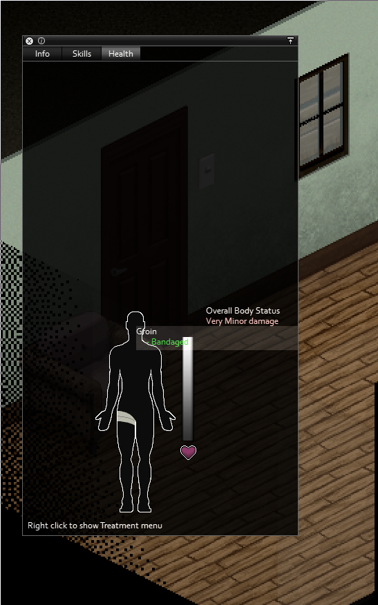
If you click and hold down your mouse on "Overall Body Status" on the health screen, you can drag the character display anywhere you want.
-
Currently in PZ you press Q to shout and pull zombies. I feel there certainly could be more use out of a button than just shouting from a few random phrases. Why not a Macro Wheel?! YOU can say what ever you WANT with the press of a button at what ever volume level YOU Want! Hold Q and a wheel pops up of editable macros and respective volume level adjuster! And a default center macro which will be automatically spoken upon just tapping Q. Some macros i would personally use; "Friendly Dont Friggen Shoot Me!", "Where are you (all)!?" and "We were looted again..." Volume level (ie; whipsering-normal-shout) suggested on the steam forums by Skooba Skeeve
- 3 replies
-
- 2
-

-
- macros
- communication
- (and 1 more)
-
It is a source of occasional frustration for me that you can't see farther than approximately the width of the screen from where you stand. Based on the Google Maps Street View going along Dixie Highway in Muldraugh, during the day, a survivor on the highway looking south from Knox Bank should be able to see zombies milling about in front of the Sunstar Hotel, and if that survivor had a one-story watchtower next to the road, they might be able to spot a horde as far away as Pizza Whirled. Plus, if we want to use vehicles and rifles to their full effect, we need to know what going on more than a couple hundred feet away. I like Project Zomboid's third-person view setup. I don't want to change it. What I want is to brainstorm UI workarounds for offscreen-but-within-line-of-sight data. My current thought is something like the Moodle system: icons that appear on the edge of the screen with a background color to indicate distance (perhaps dark red for just off screen fading to white at the horizon). Like on-screen objects, they would fade in or out based on your ability to perceive them, but the total amount of information they would give you as a player would be pretty sharply limited: for example, you could have separate icons for one human or zombie, for a group humans and/or zombies, for a vehicle in motion, for a side street, for a side trail, for a dead end ... I think you'd need some playtesting to figure out what distinctions to include, but you'd never put in enough to (for example) tell which survivor on a multiplayer server is coming up the highway towards you.
- 10 replies
-
- 1
-
-
- user interface
- realism
- (and 3 more)
-
After the 5th time dying because my mouse cursor was floating over in an inventory/health screen while I was aiming and didn't register the R-Click to attack (but instead as an menu interface attempt) I would like to suggest the following: When the player has the Control key pressed to initiate the combat-stance, all open menus fade-out (90% transparency over 2 seconds) and become un-clickable. This would do the following: While in combat if my cursor strays over an open menu area, I will still be able to attack and my character won't just stand there like a bumpkin while I furiously click away. Clears up the screen to provide a clearer vision of other potential incoming zombies.
-
Why do I see bearded balded men zombies in skirts running around with lipsticks in their pockets? o.O (but onto more important topics...) I might be adding more suggestions but that would most likely depend on how active the devs (or a designated spokesman) will be at engaging the community. I also hope that no one will think that by this I am asking for a preferential treatment of some sort, I am just merely stating what will motivate me personally. Currently I will be surfing this forum for a week or two to make my decision, and who knows I might be adding more suggestions. There is lots of room for improving in this game and it is brimming with potential. In the future I hope that it will get the attention it deserves, but for now it has mine. UI suggestions: A smaller inventory tab view option for the more experienced players. A visual notifier of a unspent attribute point(s). or
- 3 replies
-
- 3
-
-
- UI
- User Interface
- (and 3 more)

.thumb.png.f25c3b003d8f9a4f9a47d793b5ebb57b.png)